Rounded Corners in the Apple Ecosystem

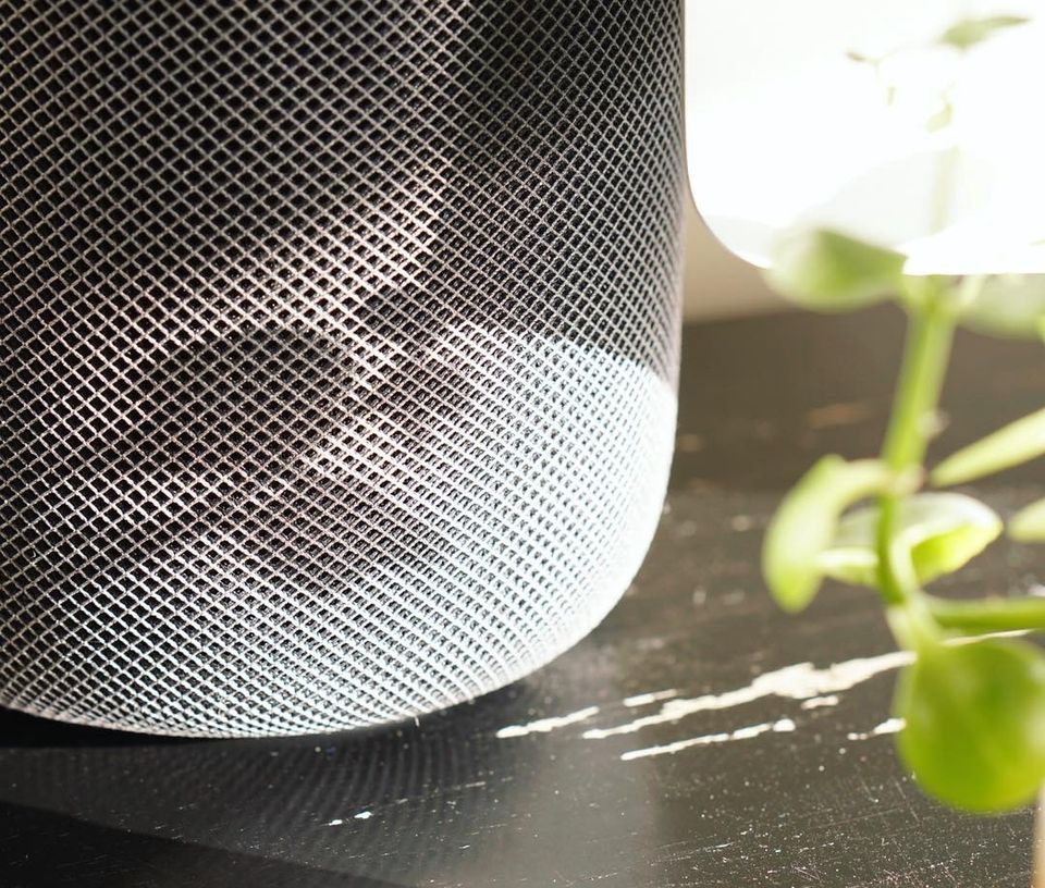
If you look closely, you’ll rarely find a sharp corner in any Apple product. From the HomePod, to keyboard buttons, to elements in Apple’s own apps, the shapes are so smoothly-rounded that it’s not apparent where the straight lines end and the rounding of the corners begin.
The Squircle
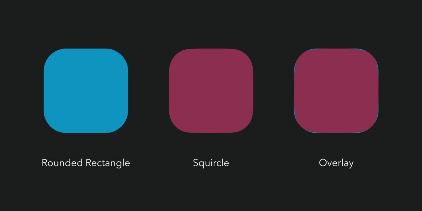
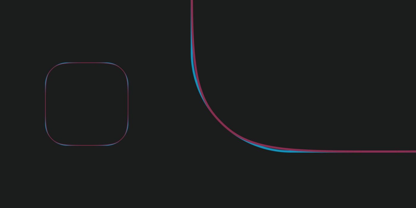
There’s a term for this. It’s called a squircle, a cross between a circle and square. Unlike more typically rounded rectangles where the corner exhibits a perfect semi-circle, squircles have a more squished shape. The rounding does not suddenly begin, instead the curve starts deep within the straight line and gradually grows into a visible curve (as shown in Figure 1.1).


While rounded rectangles have a constant corner radius, the corner radius of a squircle decreases or tightens as the curve deepens, and then symmetrically expands again on the other side of the curve.
(The mathematics behind this shape are well worth a read.)
The Effect
A complete lack of sharp edges and sudden transitions eradicates the manufactured feel that we’re so used to in mass-produced goods. Instead of reminding us of industrial supply chains, automobile production, and chemical laboratories, these softer shapes evoke succulents, pine trees, and rocks that have tumbled through mountain streams. There’s an organicquality that just feels healthy and warm.
Beyond this aesthetic/tactile effect, there’s also a pragmatic optimization. For example, driving on winding mountain roads should in theory be safer and more comfortable with gradual changes in curvature.
In The Wild
I became curious as to just how ubiquitous this squircle shape is in the Apple Ecosystem, so I started photographing everything I could and overlaying shapes over the images (see Figure 2.2). I looked at the HomePod where the squircle is exceptionally obvious, and I also looked at the iPad, the keys on the new iPad keyboard, the Apple Watch, and the purchase buttons in the Apple TV, Apple News, and Apple Music apps. As it turns out, the squircle is everywhere.


The HomePod is my favorite example. Unlike most speakers that are meant to remain hidden away, the HomePod is designed to sit visibly in a room almost as decoration. Like a hand-made ceramic artifact, the HomePod is beautiful to look at in every lighting condition. The key here is this shape — no matter how the light falls on the device the viewer cannot pick out a sharp edge.
Simple and Relevant
The effort to use curvature as a means of softening a product is not new. Piet Hein deployed the squircle in Stockholm in 1959 to solve traffic problems. Most visibly, Zaha Hadid’s architectural style centrally utilizes softly rounded shapes to evoke nature and make new constructions feel futuristic.
What’s notable about the squircle is just how simple it is. This ultra-round shape can be deployed across a suite of products — digital or physical — without altering the underlying principles or necessarily doing complex mathematics. Apple did exactly this for its hardware and software interfaces. As a result, the entire Apple ecosystem feels friendlier, more accessible, and more delightful.
I felt inspired to write this story while integrating the squircle into our app, Minimal | Notes. Take a look. If you’re a designer or iOS developer interested in bringing the squircle into the things you’re creating, check out these simple instructions.


