Building Minimal | Notes
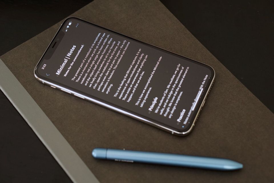
My journey as an indie developer crafting my favorite notes app
I’m a software developer, and yet I delight in coarse technology. I love a comfortable pair of pants, paper that prevents ink bleed, a table that doesn’t wobble, and a sharp knife for cutting vegetables and fish. Maybe I love this coarse technology because I learn the lesson firsthand, over and over again as I write code: simple is powerful. Simplicity allows us to focus on the most important features while making things so, so easy to use.
When I Iooked at the existing notes apps, I realized that nothing felt like a notebook. Apple Notes, Simple Notes, Evernote, Bear, and Notion all feel to me more like big binders, filing cabinets, or entire desks. There’s a lot of utility there, but there’s also a lot of noise. Sometimes all I want is a notebook, and I found myself craving the beauty of a blank page.
When sitting down to design and build Minimal I returned again and again to the sensation of a brand new notebook. When I have a fresh, empty notebook and a nice pen I feel liberated and powerful. There’s a quality of freshness: this new notebook can become anything and help me accomplish my wildest aspirations.
In building Minimal, one of the loftier goals is to honor the spacious beauty of a blank page or a brand new notebook. Perhaps less philosophically, I want to make a notes app that is as simple and easy as a real notebook. I believe it will help thinkers and doers take action in important ways.
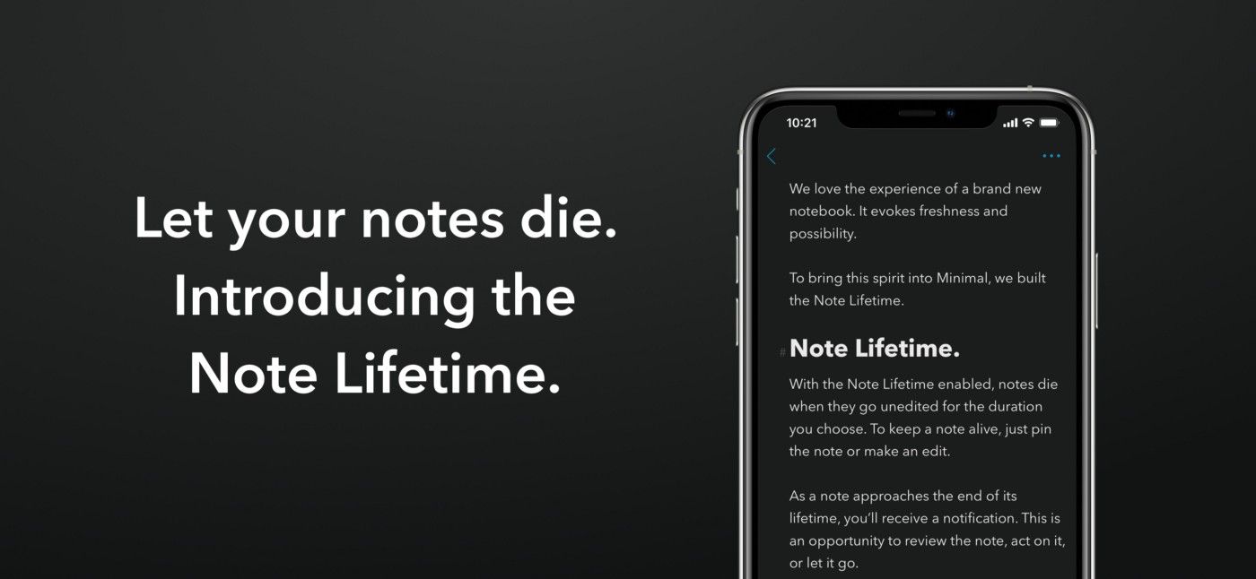
The Note Lifetime is Minimal’s most unique feature. It was difficult to design: the idea of letting notes die is mostly new for software. The closest analogy might be auto-archive in an email app, and a real life expression could be throwing away scribbles on scrap paper, or ceremonially burning a journal. For the Note Lifetime, I leaned into two core design principles: clarity — making cause and effect very clear to the notetaker — and ensuring the notetaker is in total control.
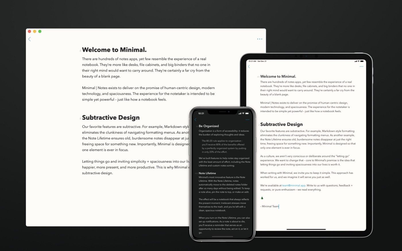
Building Minimal demands a holistic effort on my part. I’m a one man team, diving deep in design, engineering, business strategy, and marketing.
Sometimes I’m sitting at a desk, but as many readers surely know from experience going for walks tends to yield the most elegant solutions to any sort of problem, technical or creative.
There’s also a lot of programming.
I wanted Minimal to use a blend of Markdown formatting features because these simple rules closely mirror how a notetaker writes with real pen and paper. When writing in a notebook, most people find one or two use-patterns that work really well and lean into them, again and again. Markdown facilitates this flow.
At the very beginning I put myself through a crash course in Regular Expressions, or “Regex” for short. The book Mastering Regular Expressionsby Jeffrey E.F. Friedl was paramount to understanding how it works. I recommend anyone with a mild interest in mathematics read this book, for it deals with how to create workable, logical maps of a system — particularly human language. It’s mind-blowing to extrapolate principles from that book beyond the world of programming.
The two most difficult bits of code in Minimal so far have been the Markdown parser (built from scratch using Regular Expressions) and Cloud Sync (built on top of Apple’s iCloud, or CloudKit). These experiences are super fun for me — I’m more of a designer/strategist, so what I felt getting into such technical code is what I imagine a gardener feels when they put their hands in the soil, or what a foreman experiences when they get to do some of the execution: oddly refreshing.
Another major challenge is balancing powerful features with a spacious design. Everyone expects to be able to export PDFs or HTML, easily reorganize notes, share notes with friends and team members, and more. Some features/notetaker-needs get esoteric. My task as the designer is to place these tools where they will be easily discovered the moment they’re needed, and otherwise let them stay out of the way. I imagine Minimal can continually improve here.
For a great app, it’s important to intimately explore Apple’s human interface guidelines and support as many system features as possible: handoff, shortcuts, spotlight indexing, contextual menus, key commands, drag and drop, multiple windows… A lot of these use-patterns are not widely known, yet for those who are familiar they quickly become necessities. I use them often and now expect them in any real app.
Minimal is made entirely in Objective-C. I know Swift and sometimes write in Swift, but I love Objective-C’s clarity. For me, there’s just no ambiguity.
Our Mac app is made with Catalyst. The convenience of a single codebase is a non-starter (especially for a one man team), and I’m confident Minimal’s Mac app will improve as Catalyst improves: very rapidly. It’s already a beautiful app that I love writing in, and I expect it to only get better.
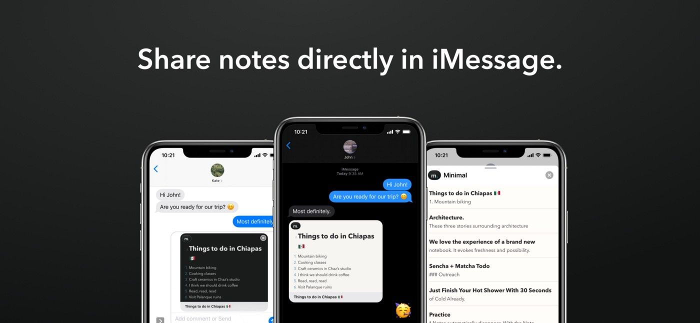
I use Minimal everyday.
I have one note pinned to the top titled “Today.” This note contains my most important and pressing tasks and goals. Some are todos that I delight in checking off, like bug fixes or life chores. Others are more general aspirations that remain relevant day after day, like “Take nature walks” or “Morning meditation.”
I have a note or two dedicated to each of my projects. At the top are immediate tasks or related readings. Going down the note we encounter things like bugs, feature wishlists, and marketing ideas.
Then there’s notes for anything that might come up: book recommendations, grocery lists, packing lists, hiking trails near Mexico City. And this is where one of my favorite features shines: the Note Lifetime. I have my Note Lifetime set to 7 days, so a week after I last edit a note I get a notification reminding me that the note is about to die. I’ll review the note and then decide to either act on it, keep the note around for another 7 days, or let it go.
Turning on the Note Lifetime was scary at first, but after using it for months now I can’t imagine not having it. It keeps my notebook clean and tidy, and consequently makes my life more spacious and organized as well.
I don’t think we realize how contextual everything in our lives is. After a week has passed, many of the things in our notebooks are no longer relevant. It’s important to set ourselves free to keep moving and stay present. If it’s important, we act on it. If it’s not important, we let it go.
Anyone can download Minimal via Apple’s TestFlight by visiting minimal.app/#beta. To get Minimal on Mac, just email me and I’ll send it your way.
Minimal is live right now in Australia and New Zealand. I’m testing business models and on-boarding while getting a general picture of how real users experience it. Soon, Minimal will be live all around the world.
Minimal needs two big features: photos support and collaborative notes. Both are doable. A notebook really should support every language too — that’s in the works.
I expect I’ll be pressured to build tagging and folders, yet I’m reluctant. Real notebooks don’t have these, and I think it’s one of the reasons they’re so delightful. Of course, the notetaker is the boss — if pressure mounts I plan to relent.
Minimal certainly needs to be presented to the notetakers who will come to value it. I’d like to hire an artist (any recommendations?) and I’d love to showcase Minimal in front of my favorite communities: blogs and newsletters, podcasts, Apple-related publications, and more general design-oriented publications. If anyone is interested in helping present Minimal, please get in touch.
I’m pleased with how this process has gone so far (I am learning a lot!), and I’m excited to see Minimal continue to unfold. Every step of the process is exciting, terrifying, and filled with challenges I try to open myself up to.
If anyone is curious, excited, or willing to give feedback, please write in. I read everything and love hearing from notetakers.
Please remember that you can always use Minimal for free in the beta program at minimal.app/#beta.
Thanks everyone. 🖤


